Wois
Expertise
Systems design
Interaction models
Usability testing
Behavioral UX
Design leadership
Role
Design lead, IC (PM, data, engineering, CEO/COO)
Links
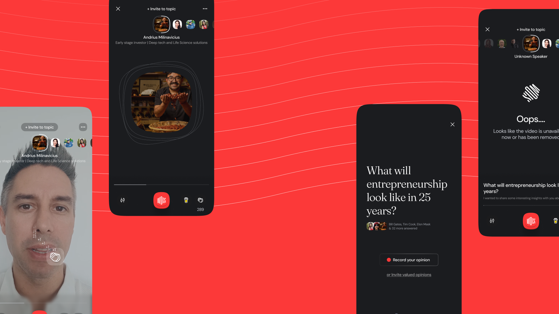
Breaking down a nested topic, speaker, reply structure so full-screen video feels as fluid as short-form feeds.
Overview
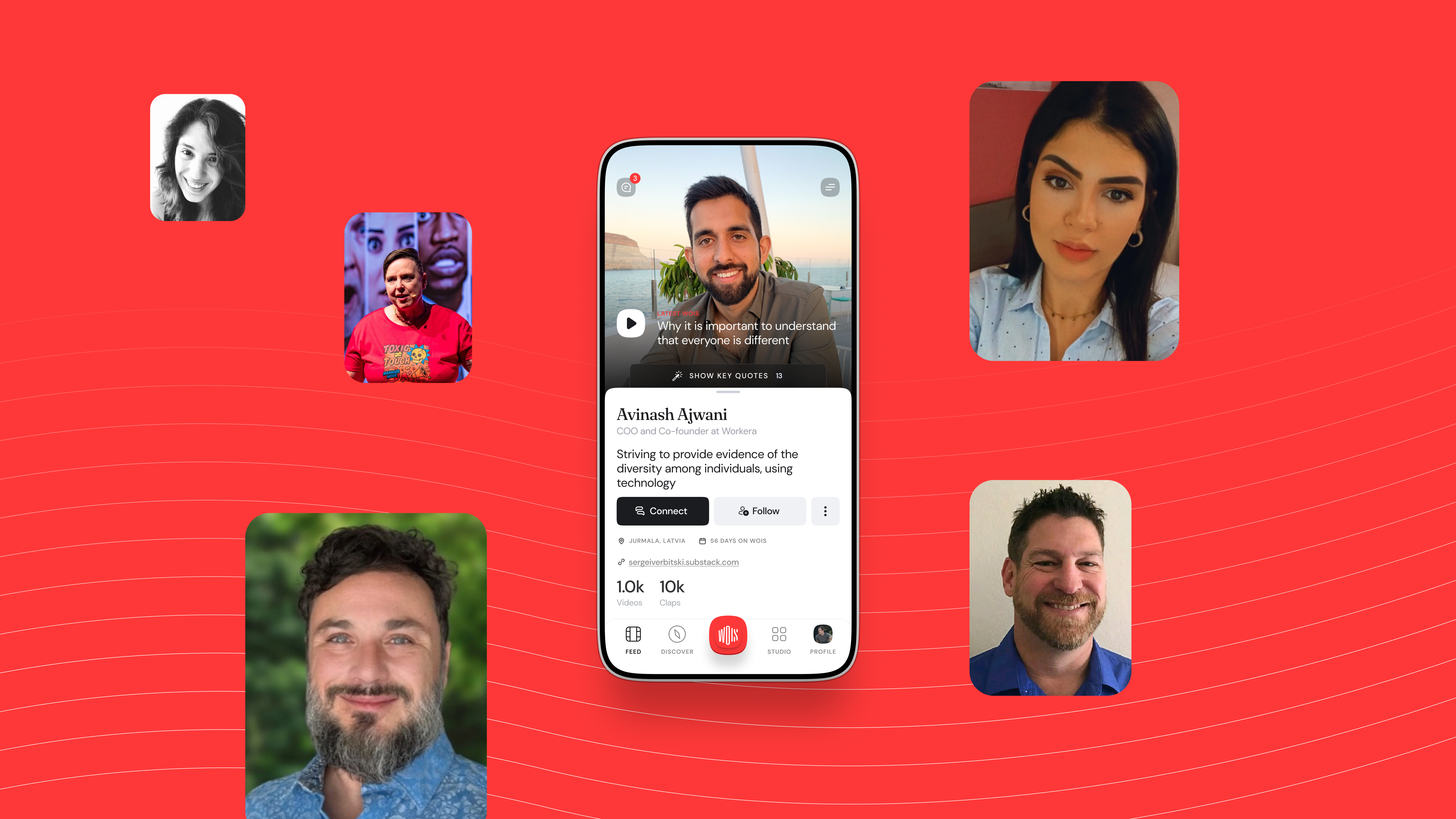
Wois is a place where speakers save and share their expertise, stories, and opinions through easy video messaging.
Unlike a creator-first feed, the content model is built around discussion. A topic holds many recorded replies from different speakers. That structure is powerful for debate, but it does not match the patterns people bring from TikTok, Reels, or Stories.
This case study walks through the full project: discovery and analysis, the interaction model and the two rounds of testing it took to get right, the final designs, onboarding, and the impact on engagement.
Goal/Problem being solved
- Design an interface that actively invites and encourages users to join the conversation, not just consume it.
- Create a dual-layer navigation system that makes switching between both topics and responses intuitive and frictionless, keeping users in the thread of discussion.
- Simplify the mental model so users immediately understand how the discussion format works, without explanation.
My role
I was the design lead and hands-on designer for this project. I owned all design initiatives and worked closely with product managers, data analysts, and developers, reporting directly to the CEO and COO.
Being part of a fast-growing startup is exciting but demanding. You need to make quick decisions, work efficiently, and stay focused on shipping things that help both customers and the business.
Discover: analysis
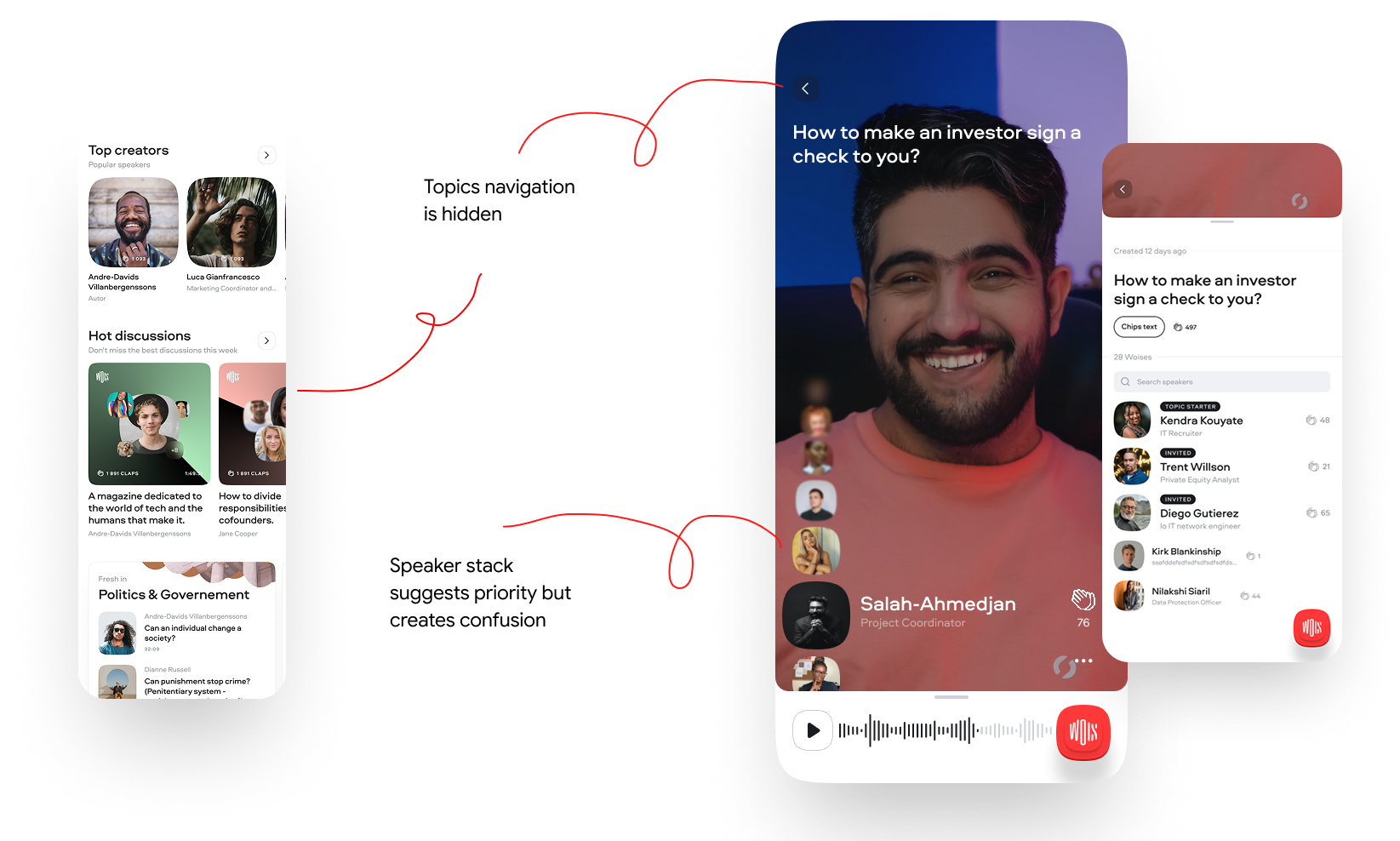
- The content structure inside the player was unusual. It was built from topics where different users recorded their responses, and the interaction was unclear.
- Finding the next topic was harder than it should be. Navigation was complicated and you had to go back to switch threads.
- The experience reduced customer trust. The exit rate was too high because it took too long to find useful information.
Instead of the typical user-to-user content, we had a topic, then speaker, then reply structure. That meant standard interaction patterns like TikTok, Reels, or Shorts did not fit well.
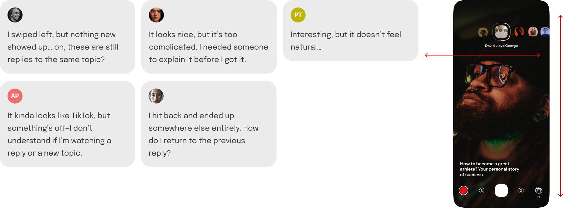
User feedback and insights
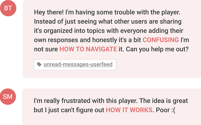
Users did not understand the system's structure. The unfamiliar format (topic, then responses, then speakers) clashed with common mental models like TikTok or Reels, creating friction and confusion. People expected a linear flow but got a nested, two-dimensional structure instead.
Navigation was unintuitive and broke the flow. Users had to go back to switch topics, which disrupted continuity. This caused frustration and dropped engagement, especially in a fast-consumption environment where fluid browsing is key.
Define: how might we
We reframed the problems as design opportunities.
- How might we create a dual navigation model that feels natural and fluid?
- How might we reduce cognitive load and increase confidence to participate in discussions?
- How might we turn confusion into curiosity through progressive onboarding or micro-interactions?
Strategy
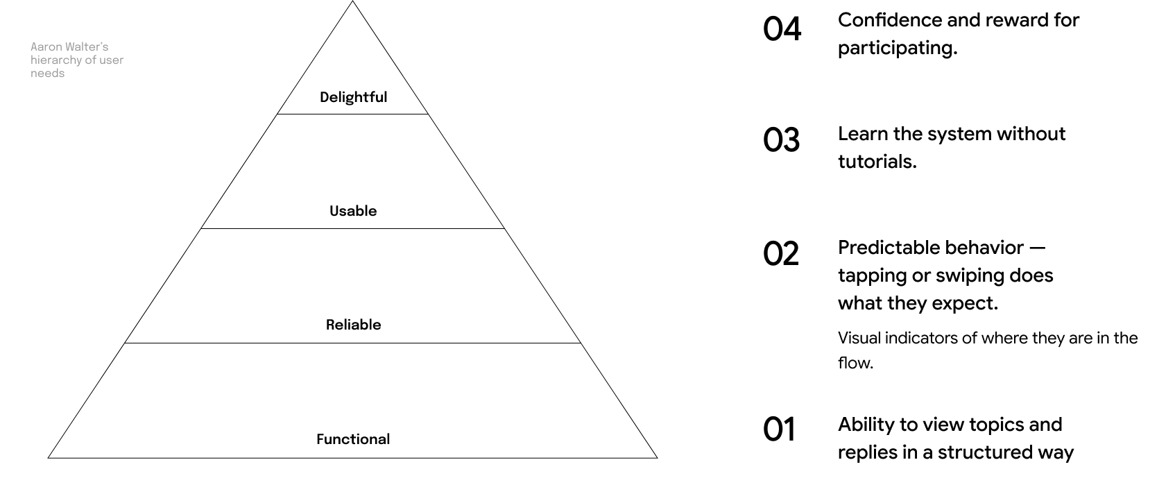
I sequenced the work along Aaron Walter's hierarchy of user needs: make the structure functional first, then reliable, then usable, and finally delightful enough to invite participation.
Develop: low-fidelity
To quickly validate the navigation logic and interaction flow, we built low-fidelity prototypes.
The focus was on reducing cognitive load and making the dual-layer structure, topics to responses, feel intuitive before investing in visual design.
Interaction model, first attempt
The first model mapped the two axes literally. Vertical swipes (top and bottom) moved between topics, and horizontal swipes (left and right) moved between replies within the selected topic.
In other words, the Y-axis switched context (the main topics of discussion) and the X-axis dove deeper into a specific topic by scrolling through replies. Elegant on paper.
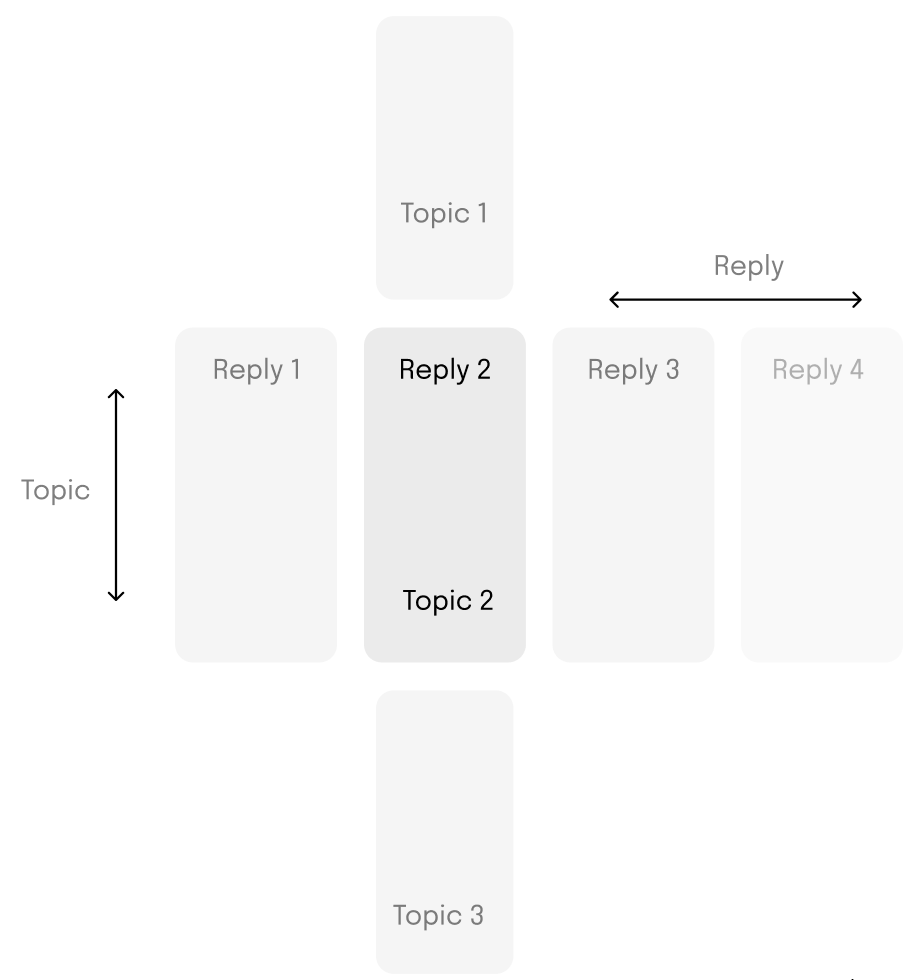
Moderated test #1 was designed to see whether users intuitively understood the logic of vertical and horizontal swipes. They did not.
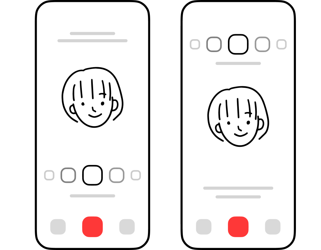
Interaction model, the fix
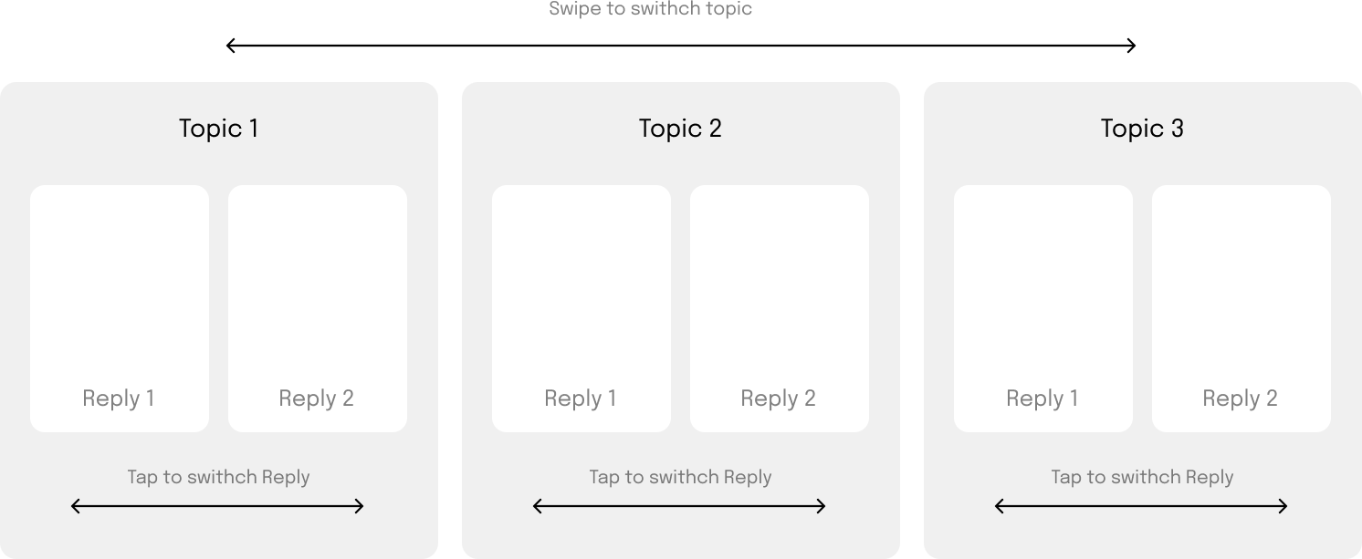
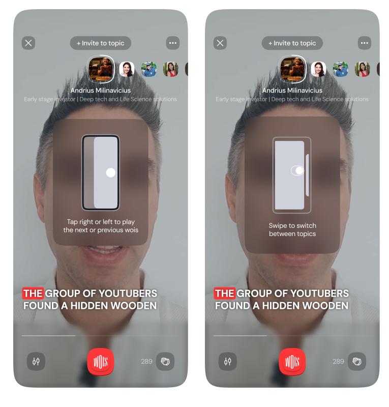
Rather than teach a novel mapping, I anchored the model to Stories-style muscle memory. Tap on the right plays the next reply, tap on the left plays the previous reply, both within the same topic. Swipe left moves to the next topic, swipe right to the previous one.
It is closer to the Instagram approach, where a tap switches stories from the same author and a swipe switches authors.
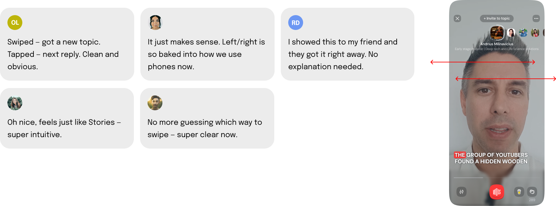
Moderated test #2 checked whether users intuitively understood tap for reply, swipe for topic. This time the guessing was gone.
Deliver: final designs
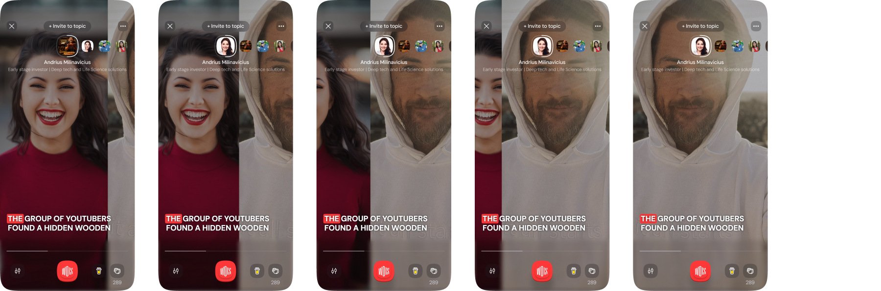
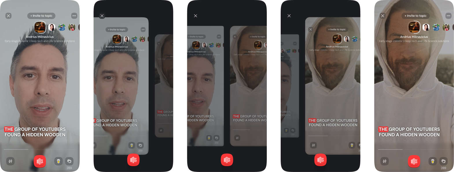
With the model validated, I designed the full-screen player around two clear gestures. Tap left or right moves through replies inside a topic. Swipe left or right moves to an adjacent topic, keeping the player shell intact.
Onboarding
A short first-run tutorial teaches the controls. It is shown the first time you open the player, with short animations that guide you step by step.
It plays twice before disappearing, or you can tap to skip after the second pass. The video is paused during the tutorial so you can focus on learning the controls.
Unblocked options
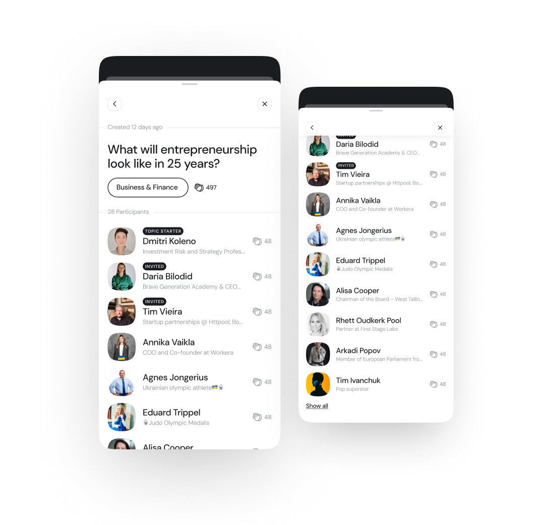
Using two horizontal gestures freed up the vertical axis. Now a swipe up opens more about each topic.
This unlocks a smooth way to reach participants, metadata, and related discussions without breaking the full-screen flow. It keeps the experience immersive while giving quick access to deeper context when needed.
Impact
Higher completion and broader exploration
After shipping tap for reply and swipe for topic, users completed more replies per topic and explored more than one topic per session.
Reply completion
42% increase
Users were more likely to view all replies within a topic after tap-to-progress shipped.
Topic exploration
28% boost
Swipe-to-topic made users 28% more likely to explore more than one topic per session.
More topic jumping
Over half
More than half of users now explore at least two topics per session, up from just one before.
Takeaways
Two lessons stayed with me after this project.
Simplicity over novelty
Familiar wins
Users do not want to learn an interaction. Even if a model is logically elegant, friction kills adoption.
Internal logic is not user logic
We were not the user
What made sense to us (Y-axis for topic, X-axis for reply) felt backwards to many people. Testing settled it.
By rethinking core interactions with the team, tapping for replies and swiping for topics, we simplified the experience, boosted key engagement metrics, and built a strong foundation for what came next.
ScopePlayer IA · Dual-axis gestures · Onboarding · Moderated testing
TeamProduct Design, Product Management, Data, Engineering, CEO/COO